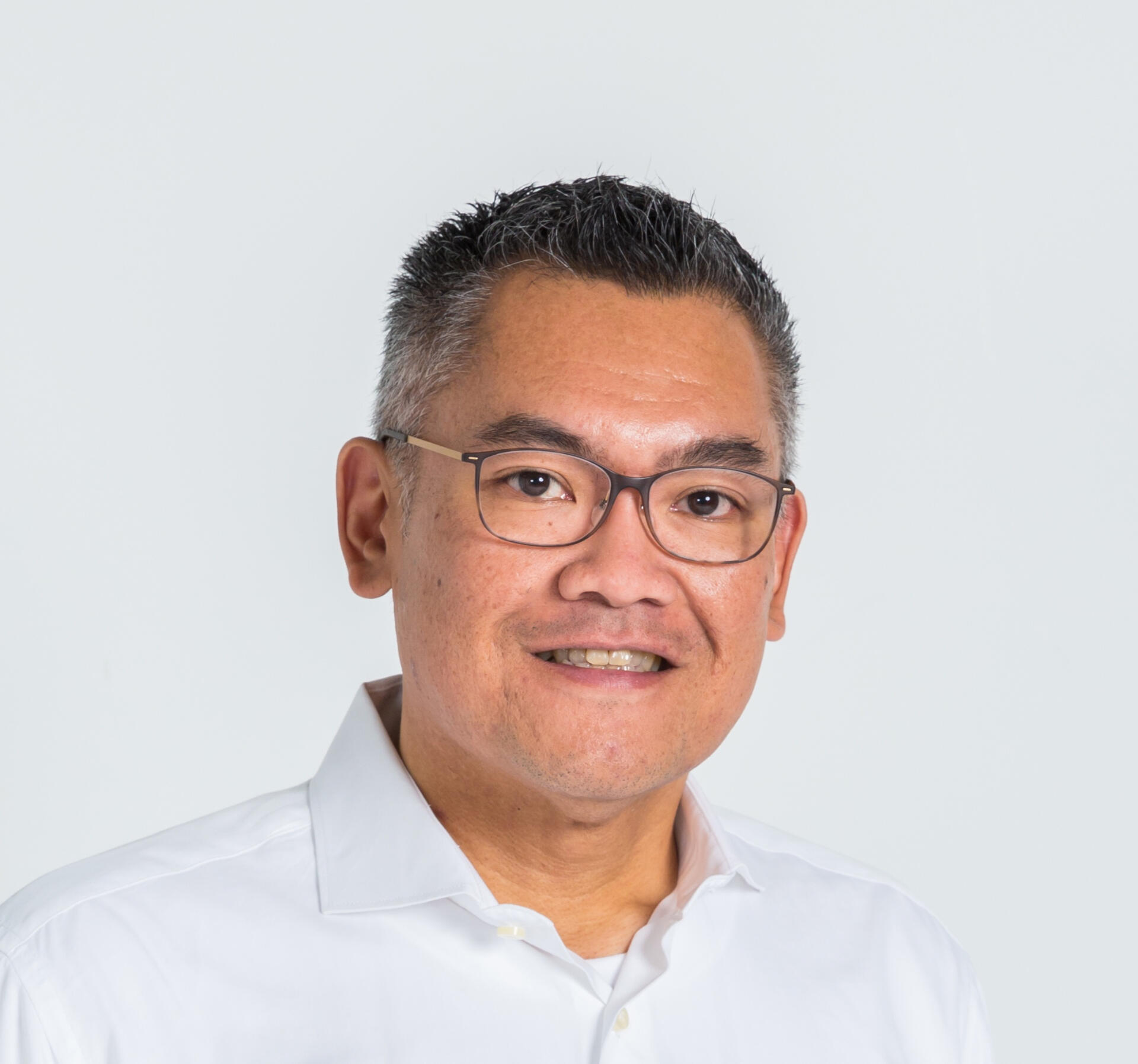
The Programmer Hierarchy (via Hacker News)

The Programmer Hierarchy (via Hacker News)

The Geosocial Universe

The Geosocial Universe

When done well, copycatting is about adjusting to local markets and learning what the first generation did right and wrong. You can’t copycat something you don’t deeply understand.

From What Indian Entrepreneurs Should Learn From MakeMyTrip’s Rocket IPO (TechCruch)

This is very true. 

Why does Yahoo Mail make it so hard for me to use its iPad-friendly interface?

I got an iPad a few days ago. When I tried to access Yahoo Mail on it by typing mail.yahoo.com on the browser, here’s what happened.

1. Yahoo Mail didn’t recognize the iPad browser and alluded to a problem with my screen resolution. It offered me to switch to an older version of Yahoo Mail. Because I don’t like the old 1990’s-style interface of the old Yahoo Mail, I opted to bite the bullet and stick with the new Yahoo Mail.

2. Now I’m on Yahoo Mail. But the site is not optimized for the touch screen. I can’t scroll through my emails. At this point, I realized I needed the mobile version of Yahoo Mail. Ah, there’s a link to go there at the top right corner of the window. Can you see it? Don’t blame yourself if you can’t. I’m guessing most people would have given up using Yahoo Mail on the iPad by this time. 

3. After clicking on the “Mobile” link, Yahoo Mail takes me to this screen. For some reason Yahoo thinks I’m using a feature phone and asks me whether I’d like to receive the link to Yahoo Mail via SMS on my phone. Oh, alternatively, Yahoo Mail says, I could go to “m.yahoo.com/mail” on my phone’s browser. I thought: Okay fine, I’ll just go there. BUT I CAN’T CLICK ON THE LINK. I literally needed to type it in on the browser.

4. After typing “m.yahoo.com/mail”, can I now read my email? Not yet. I need to pick between the New Yahoo Mail or the Yahoo Mail Classic. Whatever, I’ll pick the New one.

5. Now, I’m finally ready to read my emails. Well, look at that. It’s a nice interface after all. I don’t understand why Yahoo made me jump through all the hoops before taking me here. There are a few design decisions that I’m not crazy about, like the 5 icons you see at the bottom of the screen towards the right side. 

(a) The first two icons look very similar. The first one is supposed to be a shield. You click it to mark an email as spam. The second one is supposed to be a trash can, but it’s more like an ugly trash can.

(b) The third icon is a purple circle. What does it mean? I had to click it to know what it does.

(c) The right-most icon (the three dots) is an ellipsis. If you click it, you’ll get a pop-up for more actions. But why have an ellipsis there? There’s still plenty of room for more icons.

By the way, how does Google give you Gmail on the iPad? Here’s what happens if you type mail.google.com on the browser:

iPad-optimized layout in one step.

Update: Not long after I posted the above, Yahoo made changes to their Mail service. Now if you use the browser on the iPad to go to mail.yahoo.com, you’ll get the iPad-optimized layout.

Enhanced by Zemanta

startupquote:

If you are not embarrassed by the first version of your product, you’ve launched too late.
- Reid Hoffman

startupquote:

If you are not embarrassed by the first version of your product, you’ve launched too late.

- Reid Hoffman

Starbucks Mobile Payment: Technology for the sake of being cool?

I read an article on Read Write Web today about the expansion of the Starbucks mobile payment program. The program was launched as an iPhone app in September 2009 to Starbucks outlets in Seattle and Bay Area. After expanding the program to over 1,000 outlets in March 2010, Starbucks announced that it would deploy to even more stores across United States.

Here’s a video from September 2009 about using the iPhone app to purchase Starbucks coffee.

The Starbucks iPhone app is actually more than just for payment. It is also a loyalty program where customers can get points (“stars”) with every purchase. The expansion of the program indicates success. But why?

The customer loyalty program makes sense to me. Coffee is addictive and a lot of people drink it out of habit. With so many coffee shops around, it makes sense to have a loyalty program to bring your customers back to you. I almost always sign up for a loyalty program in stores that I frequent, and I would get a Starbucks Card if they offered it in Singapore. 

However, what is the benefit of having a mobile payment program in the iPhone app? In what scenario would you use the mobile payment app in place of cash? Is it when you’re out of money? I think most people will have enough cash in their wallet to pay for a few cups of coffee. If I don’t have $10 in my wallet, I’d be in front of an ATM before I go to a Starbucks. Is the mobile payment app for the times when you forgot to bring your wallet? Even if I have my iPhone with me, the first thing I’d do is go back and get my wallet, not to go to a Starbucks.

I also don’t quite understand the motivation for paying with an iPhone app. You’d have to pull out your iPhone, run the app, press a few buttons and scan the bar code. The video above shows that the process could be a little awkward. It’s definitely less convenient than pulling a few dollar bills out of your wallet.

So, what’s the point of the mobile payment system? This is not a rhetorical question, by the way. I’d really like to know from those who have used the app before.

Enhanced by Zemanta

Can you create a company based on another company’s weakness?

From a Lifehacker article, I discovered Micromobs, a website that provides private group messaging service. Their usability design is very similar to Facebook Group where you can post something (a picture, pithy comment, etc.) and have your friends comment on them. The overall web design takes the “best of” Facebook and Twitter features, including trending topic and 2-column display.

You may ask: Why would  anybody use this instead of Facebook or Twitter? To quote the Lifehacker article:

Micromobs is designed to offer easy to control and scalable social networking without the openness of other social networks. The emphasis on group-specific communication and networking means your family reunion planning, paintball team musings, or workplace joking doesn’t end up plastered all over Facebook.

Privacy has been a hot topic with Facebook. I frequently see updates from strangers in my Facebook news stream, just because my friends comment on them. And when I click on the stranger’s profile I can then see their photos and other items which they probably don’t intend for the public to see.

So I can see the value of having a more private community where you can share and discuss things without worry. But do you really want to start a company based on Facebook’s weakness? I personally don’t and here’s why:

  1. When it comes to privacy, it’s not like Facebook has their head in the sand. They know people are calling for better privacy control and I bet Facebook will come up with a palatable solution for most people. Facebook has millions of dollars in resources.
  2. I won’t get any personal satisfaction from taking a feature of another website and calling it my own. I just don’t see enough differentiation between Facebook Group and Micromobs right now — not in design or user experience.

I’m not saying getting inspiration from other companies is bad — Facebook, Twitter and Friendfeed all copy features from one another. You can in fact bluntly copy another company’s whole business model and move it to another location (see the many Groupon clones for example). I just think that if you want to create your own company, at least try to make it stand out. What do you think?

startupquote:

People capable of making enough money to never work again are the same people who will never quit working.
- Chris Dixon

startupquote:

People capable of making enough money to never work again are the same people who will never quit working.

- Chris Dixon